
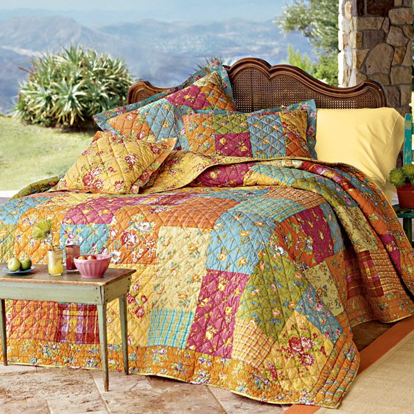
Although I tend to like sepias, faded prints and all the romance of the shabby chic look I have never used it in my house except in extremely limited ways, I guess given I lived with all males and tended to want them to feel comfortable in their own home (not withstanding the wearability/dirt factor of boys!), I tended to lean more towards a sort of muted jewel tone palette. Thinking this house through I still do not see myself going in that direction when furnishing and decorating it, and that's a good thing I guess as my bedroom did not turn out to be the soft soothing yellow I envisioned but slightly more BRIGHT. It took three coats of paint to cover that gray and I am not in the mood to repaint so have been looking for a way to tie this altogether into a look that will be comfortable and fun. I happened across this pattern at The Company Store and think I am going to go with it - the newer, bolder, wilder side of me just may be emerging!
No comments:
Post a Comment